YQR project wins Kitchen Renovation of the Year for 2019 at the Regina Home Builders Master Awards
This busy family of four lives in a great Regina neighbourhood on a quiet bay. They love their neighbours and the kids love their school and friends. The generous footprint and overall layout of the house still worked well, but their home was becoming tired and dated. They were faced with the question of whether to build new or renovate. We were so fortunate that they reached out for our help to reinvent their home!
A rustic modern look with a timeless aesthetic
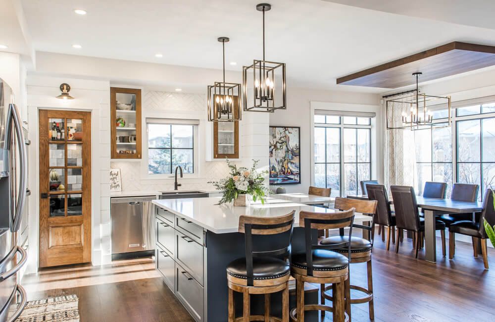
The minute I walked into their home I could see potential. Their home was beginning to date with natural maple cabinetry that had yellowed over time and an inefficient, angled island with a raised eating bar. Dark wall colours and matching, satin nickel light fixtures throughout their home were a dead giveaway that this house was built in the early 2000’s. This family craved a rustic modern look with a timeless aesthetic, but weren’t sure how to even begin such a large project. Luckily for us, we knew just where to start!
Priority 1: Getting the layout right
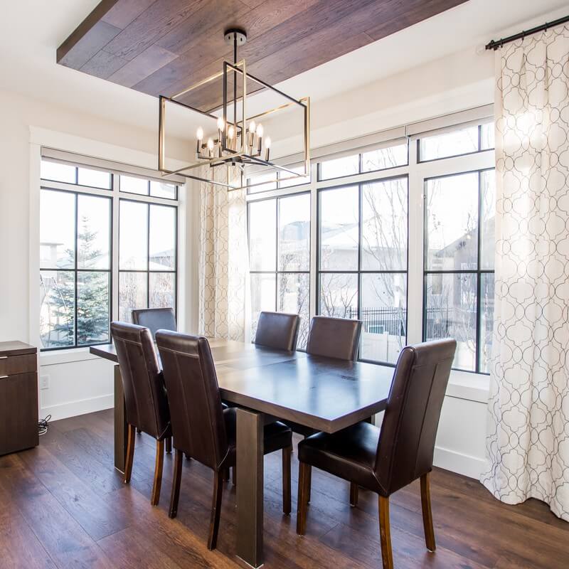
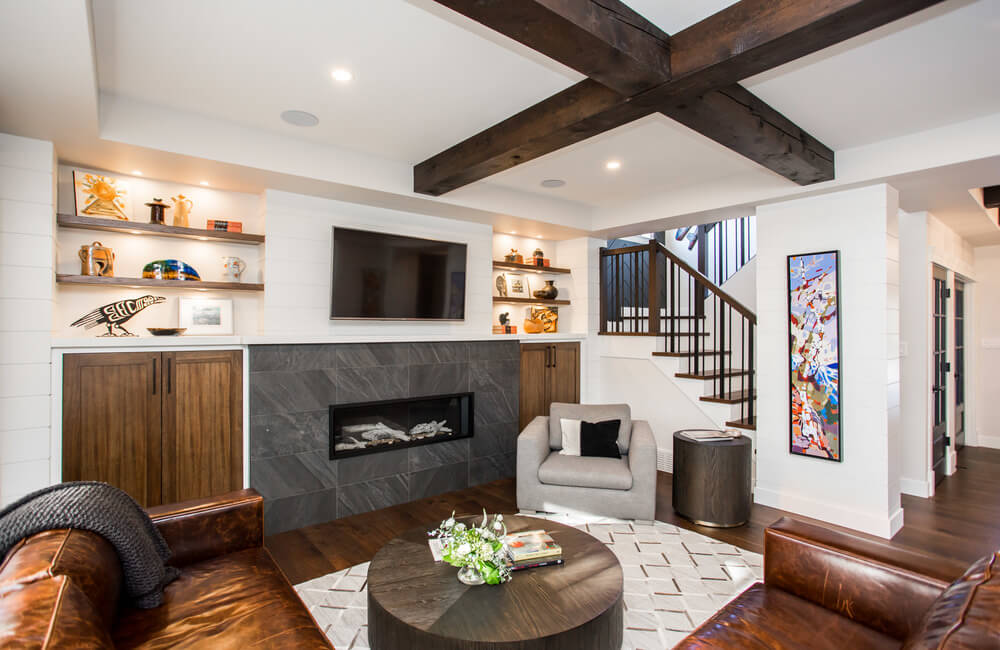
Many people wonder where to start renovating, and where to invest or splurge and where to save. I always counsel clients to invest in the right layout first and foremost. You can always upgrade finishes such as flooring or countertops later on, but if your kitchen layout isn’t right or you leave that wall up that should have come down, you’ll always wish for more. In this home, we were blessed with nine-foot high main floor ceilings, which allowed us to add architectural interest with tray ceiling and authentic wood beams and bulkheads. We also blocked off the old walk thru pantry from the mudroom. It allowed us to create a larger butler’s pantry off the kitchen (with a ton more storage!) while also adding bench seating and a walk-in closet in the new enlarged mudroom. We also added a new window in the stairwell, stacking one above another, to create a more dramatic vertical space with so much more natural light. These smaller “tweaks” to the original floorplan have transformed how they use their spaces daily!
Priority 2: Get the look right
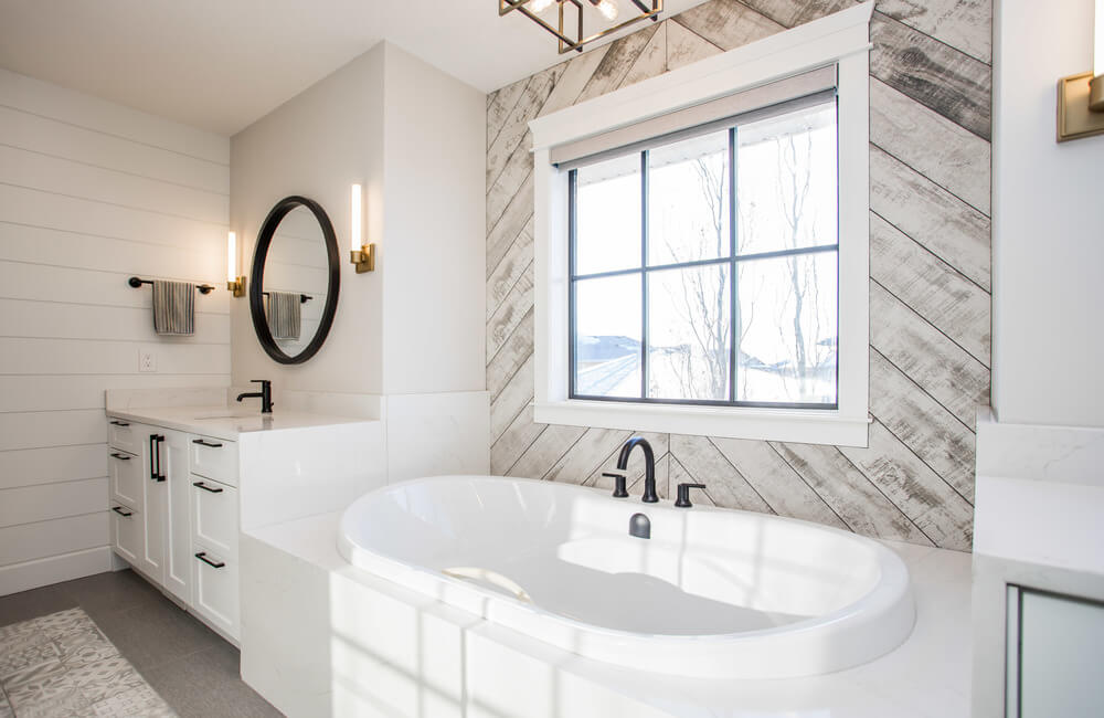
We always encourage our clients to be open to new ideas and this family wholeheartedly threw their trust into us. We can’t tell you how important that relationship is, both during the design phase as well as the construction phase of the project. It meant we had creative license to think outside the box and come up with new ideas which were met with open arms and minds. One such idea was to add black mullions in a square pattern into the existing white PVC window jams. It was amazing to see how one small mullion detail on the windows transformed the overall look and feel of the entire space! We encouraged our clients to consider utilizing the services of a 3D render specialist so they could see all the finishes, colours and fixtures together in a real-life render. It meant they could push the “go” button with confidence, knowing they were getting the exact look and feel they wanted. Here’s a secret: even though we are design professionals, a 3D render helps us too as we examine which finishes look best in combination, and ultimately ensure each space is curated to look as we planned. Our render specialist is so good it’s hard to tell a render from the actual photo! Thanks to Jeff from 3D Liquid Light for doing such a great job!
Related Articles
Priority 3: Focus on quality and value
Renovating is a process of identifying priorities, then an ongoing tug of war between where to splurge and where to save. In the end, you have to trust your contractor (Alair Homes) to provide you with top quality tradespeople and find value-add product suppliers.
In the end, this family got just what they wanted — a stylish home with quality finishes that is unique to them!
Project Partners
Holli Appelquist Interior Design
Photo credit Picturesk Media
